INDUSTRY:
E-COMMERCE
CLIENT:
SAVAGE X FENTY
ROLE:
LEAD PRODUCT DESIGNER
FOCUS:
UX RESEARCH & AUDIT,
CONVERSION RATE OPTIMIZATION
DESIGN SYSTEMS,
MOBILE-FIRST UI,
BRAND IDENTITY

Driving Conversion Growth for an Iconic Lingerie Brand
summary.
Savage X Fenty was scaling fast — but its digital platform wasn't keeping pace. I joined as Lead Product Designer during a major CMS migration, at a point where delivery was already in motion but UX priorities were unclear.
Across a multi-track engagement, I set the UX direction and led the redesign of checkout, product discovery, branding, and the shopping bag — turning a fragmented experience into a cohesive, conversion-focused one.
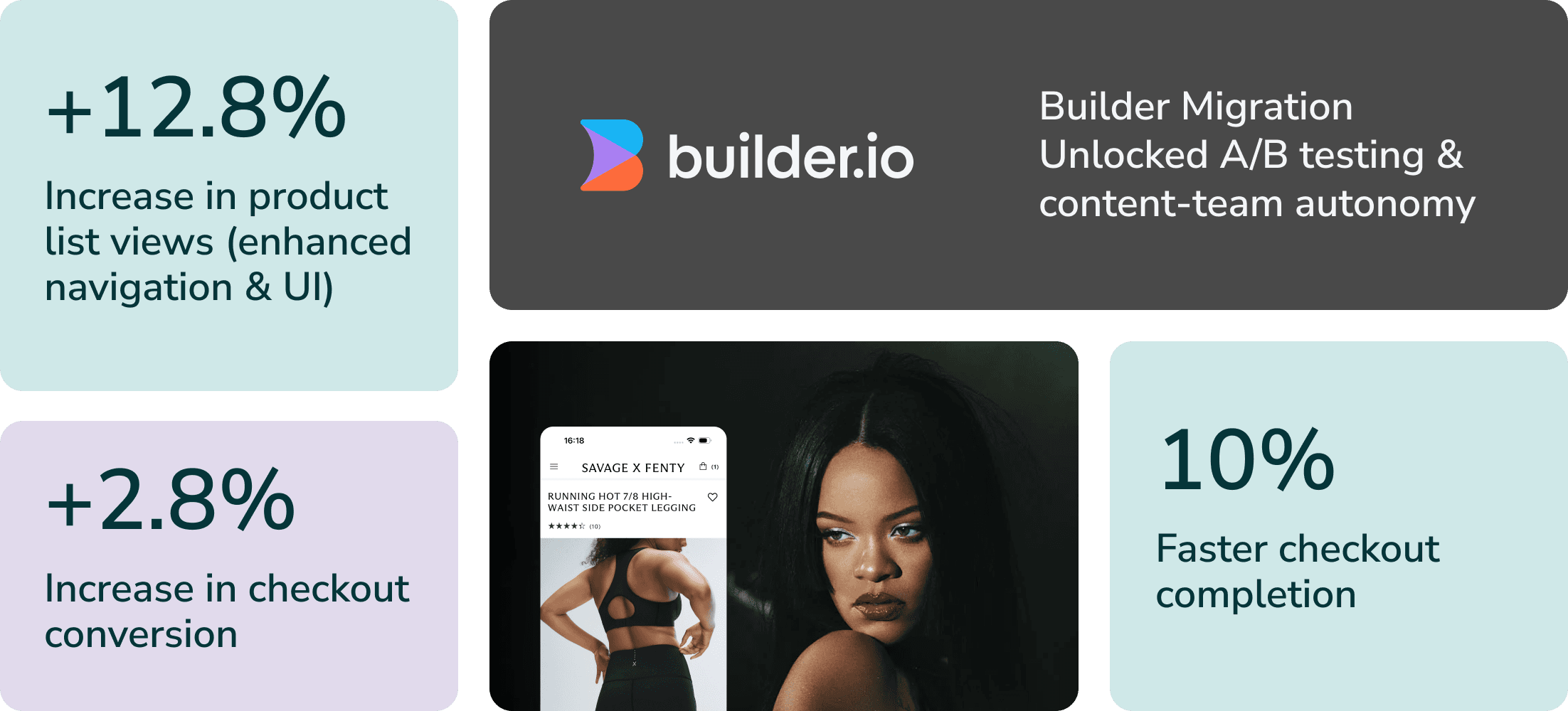
The result: a +2.8% increase in checkout conversion, a +12.8% increase in product list views, and a 10% reduction in checkout completion time.
As Lead Product Designer, I owned the work end-to-end — from UX audit and strategic roadmap through high-fidelity UI and design-system delivery. I partnered closely with Whitespectre's engineering and product teams and Savage X Fenty's in-house brand team, staying hands-on through implementation and QA to make sure the design held up in the live product.
Delivered: UX audit, strategic roadmap, checkout & shopping-bag redesign, design system, brand refresh.
challenge.
Objectives:
Increase conversion across key shopping journeys
Improve product discovery, navigation, and checkout efficiency
Establish a clear UX starting point for the platform and design
Constraints:
Limited access to behavioral and performance data
Engineering capacity focused on the CMS migration
No prioritized UX roadmap in place
Founded by Rihanna in 2018, Savage X Fenty quickly became a leader in inclusive, body-positive lingerie. But rapid growth and international expansion exposed gaps in the digital experience: no consistent component library, no clearly defined user flows, and no measurement framework to guide decisions. We were building on a fragile foundation while the business kept scaling.
The challenge was to identify where UX/UI improvements would have the greatest impact on conversion and customer experience, and to deliver a clear, strategic roadmap — without slowing the wider platform work already in motion.

approach.
Methods: Heuristic Evaluation · Competitive Benchmarking · User Journey Mapping · Cross-functional Workshops
To modernize the UI and UX of Savage X Fenty's e-commerce platform, I started with a comprehensive UX audit and competitive analysis. This surfaced key opportunities across the checkout flow, shopping bag, PLP and PDP pages, navigation, design system, branding, and accessibility.
From there, I translated the findings into a prioritized, year-long roadmap — sequencing work by impact and effort, and starting with checkout because it carried the highest revenue impact. Branding ran in parallel as its own track. This turned a long list of issues into a focused, defensible plan the whole team could move on.
key decision 1/4.
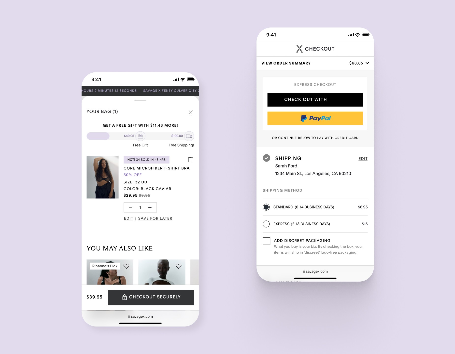
Conversion-Driven Checkout Optimization
+2.8% increase in checkout conversion
10% reduction in completion time
Small reductions in friction at the point of conversion unlock outsized gains — especially when that friction makes the product feel like it doesn't trust its customers.
Checkout was the single biggest revenue leak, so I prioritized it first — despite pressure to start with branding. I led targeted UX/UI improvements to make the path to purchase faster and clearer: streamlining the checkout steps, making shipping and payment information optional when valid details already existed, clarifying the structure of each step, and improving visual cues and progress indicators to reduce confusion.
For returning customers specifically, logic that surfaced their saved information cut unnecessary friction — reducing checkout completion time by 20% for that group. The guiding principle throughout was progressive disclosure: show only what's needed at each step, and never make a returning customer re-enter what we already knew.
key decision 2/4.
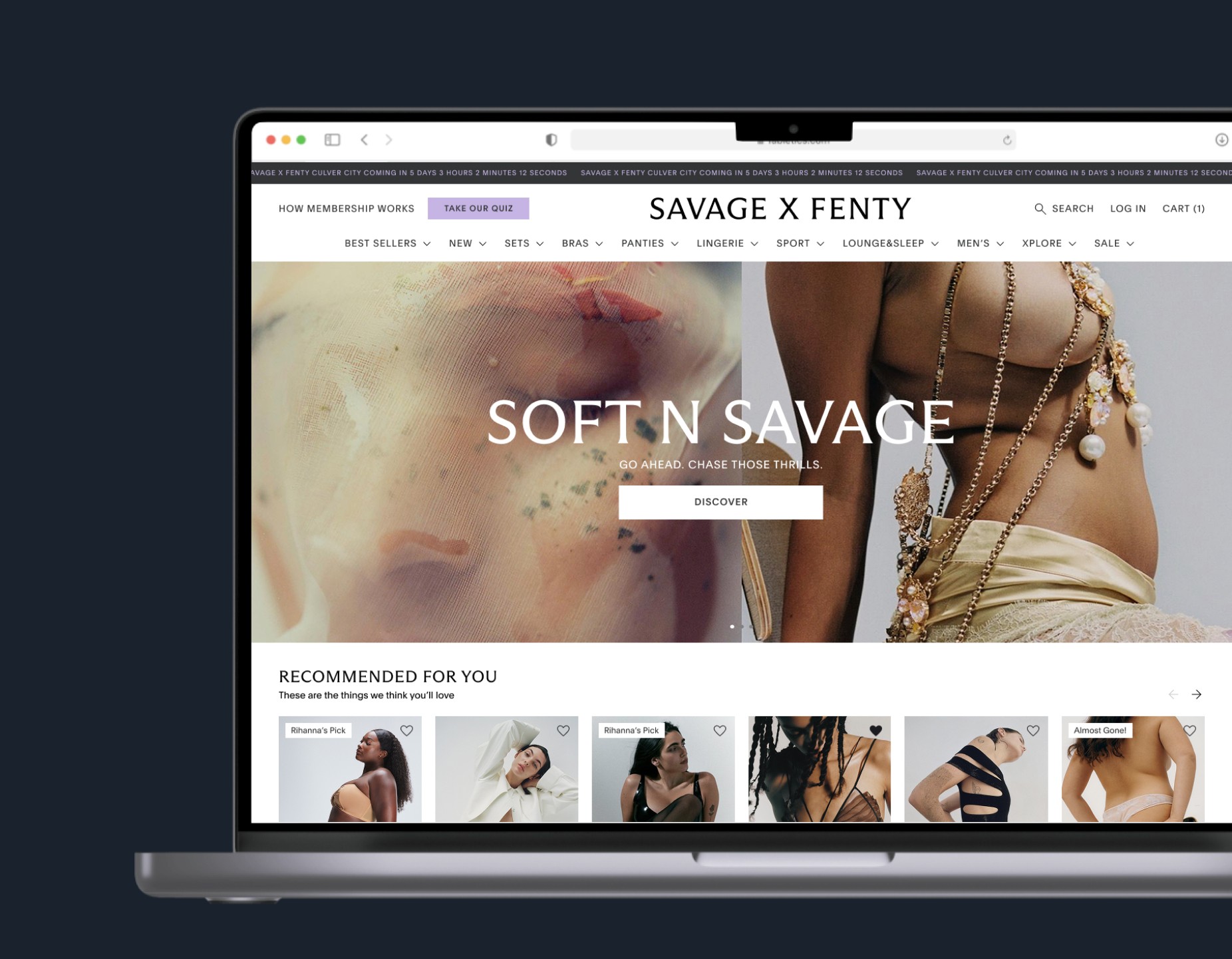
Brand Refresh & Design System: Building for Scale
The real constraint wasn't visual — it was executing a full rebrand on a live, high-traffic store without a big-bang launch. Everything shipped incrementally, in parallel with feature work.
Sub-section — Elevating Brand Presence & User Perception:
The rebrand aimed to create a more impactful, cohesive brand identity — strengthening how users perceive and engage with Savage X Fenty. I aligned the visual identity with the brand's bold, confident voice while improving usability and accessibility.
Key updates included:
Refined color and typography to reinforce the brand's confident aesthetic
Sharper, more structured UI that improved visual hierarchy, contrast, and accessibility
Mobile-optimized design refinements for high-performing experiences across devices
Scalable & Systematic Design Foundation:
Beyond the UI refresh, I built a well-structured Figma design environment and a comprehensive Design Library — consolidating components into a single shared source of truth. This improved team workflow, sped up design-to-development handoff, reduced friction in implementation, and gave the team a scalable system to support future iteration and growth.
The rebrand was executed without breaking the live experience: deployed incrementally alongside ongoing feature work, in close collaboration with stakeholders and developers, and launched with zero major post-release issues.

key decision 3/4.
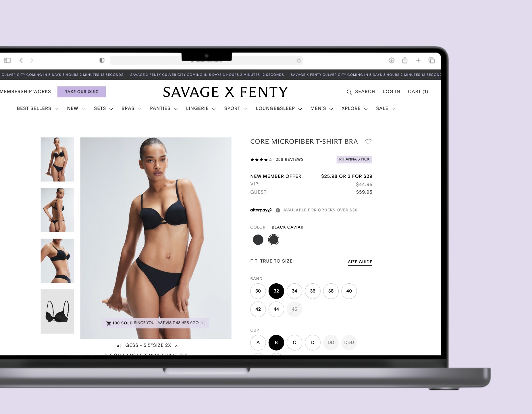
Optimized Product Discovery & Navigation
+12.8%
increase in product list views
The Product Listing Pages lacked clear product context and intuitive navigation — especially on mobile, where outdated filtering and infinite scroll made browsing difficult and made it hard for users to return to items or hold their place.
I redesigned the experience around clarity and control: a redesigned grid for better product context, revamped filtering and sorting built around real user behavior, a structured category bar, and refined product cards. I also applied progressive disclosure to complex filters to reduce cognitive load. Together, these improvements made browsing more intuitive and drove a 12.8% increase in product list views.
I replaced infinite scroll with pagination — a counterintuitive choice given current trends, but the data showed users struggled to return to items and hold their position. Pagination gave them control and improved return-visit patterns.


Key Decision 4/4.
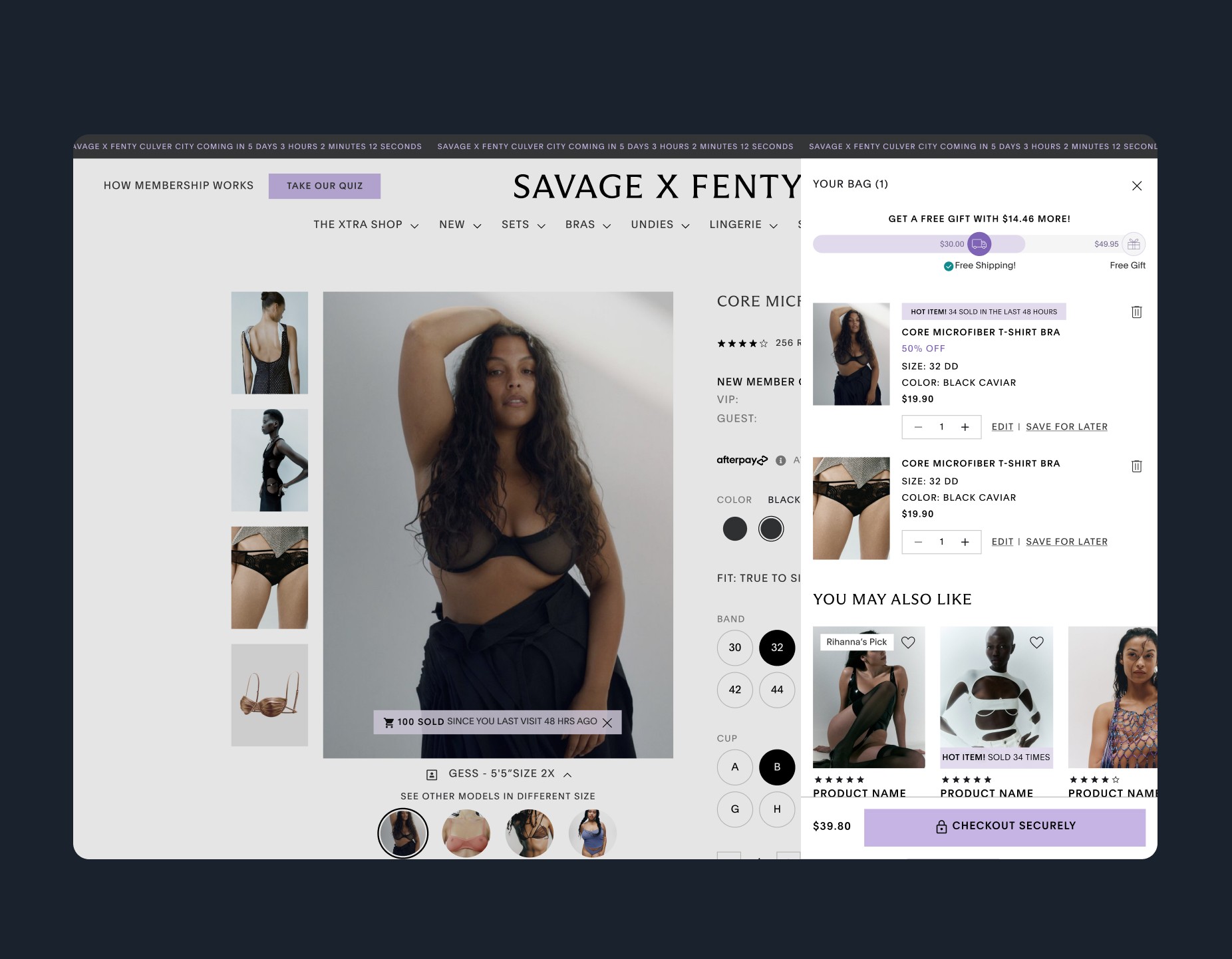
Shopping Bag Revamp: Streamlining the Pre-Checkout Experience
Because of SXF's membership model, the bag had to surface membership savings and set-completion nudges without cluttering the core checkout path — a complexity standard e-commerce bags don't carry.
As the second phase of checkout improvements, I reimagined the Shopping Bag to remove the friction users hit just before checkout. The existing mini-cart appeared when an item was added but showed almost nothing useful — no quantity, color, or size — forcing users to open the full bag page just to confirm what they'd added. That detour broke the shopping flow and cost conversions.
After user testing and data analysis, I replaced it with a unified side drawer that kept everything in context:
Enhanced sets & bundles display — visually breaking down multi-item sets and adding progress indicators for incomplete bundles, nudging users to complete their sets for savings
Smart product grouping — consolidating identical items instead of listing them separately, matching how people actually read their cart
Comprehensive product details — size, color, and adjustable quantities, all editable without leaving the page
A transparent order summary — surfacing shipping and tax upfront, not just item prices, to remove end-of-checkout surprises
Free-shipping progress and a sticky total with a prominent CTA — keeping the path to checkout one tap away
By keeping decisions in context and removing the detour out of the shopping flow, the redesigned bag streamlined the path to checkout and supported the overall conversion gains.
results.
Transforming the Savage X Fenty Digital Experience
What stayed with me: impact at this scale comes from building the system, not just the screens. The biggest win wasn't any single redesign — it was leaving the team with the infrastructure to keep improving without me.
Across a multi-track engagement, I redesigned and restructured Savage X Fenty's digital platform — driving measurable improvements across conversion, engagement, and retention. By prioritizing a mobile-first approach, I streamlined the shopping experience, refreshed the brand's look and feel, and improved overall clarity and usability.
Key outcomes:
+2.8% increase in checkout conversion, with a 10% reduction in completion time
+12.8% increase in product list views through enhanced navigation and UI
A full brand refresh that strengthened brand identity and usability
A Shopping Bag revamp that reduced friction and increased seamless order completion
Full migration to Builder.io, giving the content team autonomy to run A/B tests and targeted campaigns without engineering dependency
testimonial.
We enhanced the customer journey, streamlined the path to purchase, and successfully brought our refreshed brand vision to life — ultimately delivering a measurable impact on engagement, conversion, and our brand presence.

Vaughn Harber
VP of Product Management

