Revamping Shopping Experience of an Iconic Lingerie E-Commerce
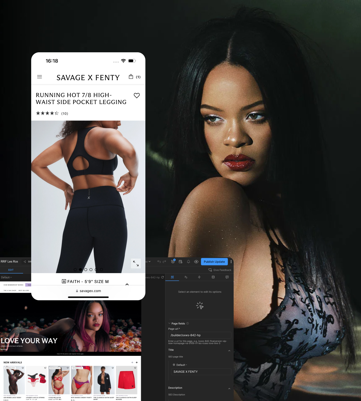
Savage X Fenty is an e-commerce platform offering bold, inclusive lingerie and sleepwear designed for every body and occasion. The brand blends fashion-forward styles with accessibility, making luxury lingerie more inclusive. Its e-commerce platform offers a seamless shopping experience with intuitive navigation, engaging visuals, and personalized membership benefits.
Client
Services
Year
Background
Savage X Fenty (TechStyle Fashion Group)
Rebrand, UI/UX, Research & Analytic, Information & Technical Architecture, Workflow Optimisation, Conversion Growth
2023-2025
As the lead designer for Savage X Fenty, I worked on enhancing key shopping experiences to drive higher conversions, engagement, and scalability. Through in-depth analysis and strategic design improvements, I helped modernize the platform, streamline user flows, and optimize communication clarity—creating a stronger foundation for growth and an improved customer journey.
Challenge
Founded by singer Rihanna in 2018, Savage X Fenty quickly became a leader in inclusive, fashion-forward lingerie. As part of TechStyle Fashion Group, a tech-driven retail powerhouse, the brand thrived on accessibility, innovation, and high-profile celebrity influence.
However, its unprecedented success and rapid growth exposed limitations in its digital infrastructure, revealing gaps in architecture and user experience. The existing tools and systems struggled to scale, restricting the ability to experiment with content, optimize user flows, and adapt to evolving customer needs.
To sustain growth and elevate the user experience, Savage X Fenty needed a strategic design approach to refine its platform, enhance scalability, and create a seamless, engaging, and high-converting shopping journey.
Approach
To modernize the UX and UI of Savage X Fenty’s e-commerce platform, we started with a comprehensive audit and competitive analysis. This revealed key opportunities to refine the checkout flow, shopping bag experience, PLP and PDP pages, and overall brand consistency. Based on these insights, we developed a strategic, year-long enhancement roadmap prioritizing a mobile-first approach, clearer communication, and improved product discoverability—all aimed at creating a smoother and more engaging shopping experience.

To modernize the UX and UI of Savage X Fenty’s e-commerce platform, we started with a comprehensive audit and competitive analysis. This revealed key opportunities to refine the checkout flow, shopping bag experience, PLP and PDP pages, and overall brand consistency. Based on these insights, we developed a strategic, year-long enhancement roadmap prioritizing a mobile-first approach, clearer communication, and improved product discoverability—all aimed at creating a smoother and more engaging shopping experience.
Conversion-Driven Checkout Optimization
Through a series of targeted UX/UI enhancements, Whitespectre helped Savage X Fenty create a more seamless and efficient digital shopping experience.
One of the most impactful improvements was the checkout flow optimization. The original UI/UX contained redundant mandatory steps for all users, regardless of their familiarity with the site. Additionally, unclear step initiation, inconsistent states, and lack of progress visibility caused confusion and friction in the process.
To address this, we streamlined the checkout journey by:
Eliminating unnecessary steps and making some optional for returning users when shipping and payment details were already available.
Clarifying the structure of each step, improving visual indicators for progress, and enhancing input field states.
Optimizing payment method interactions to provide better clarity, usability, and security for sensitive information.
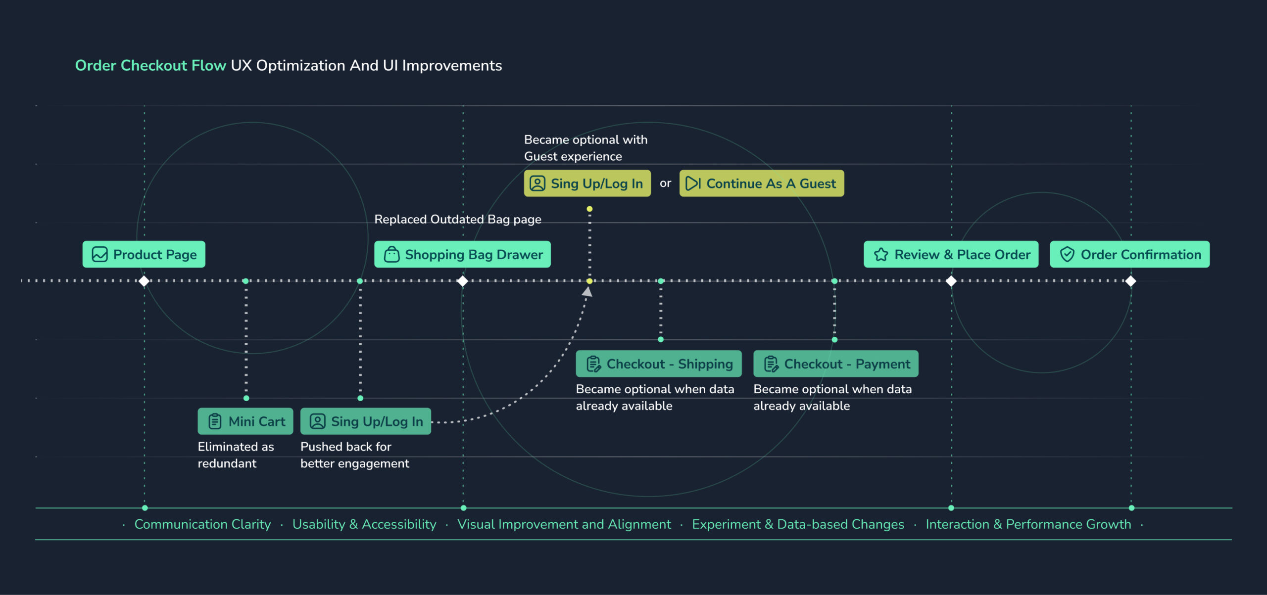
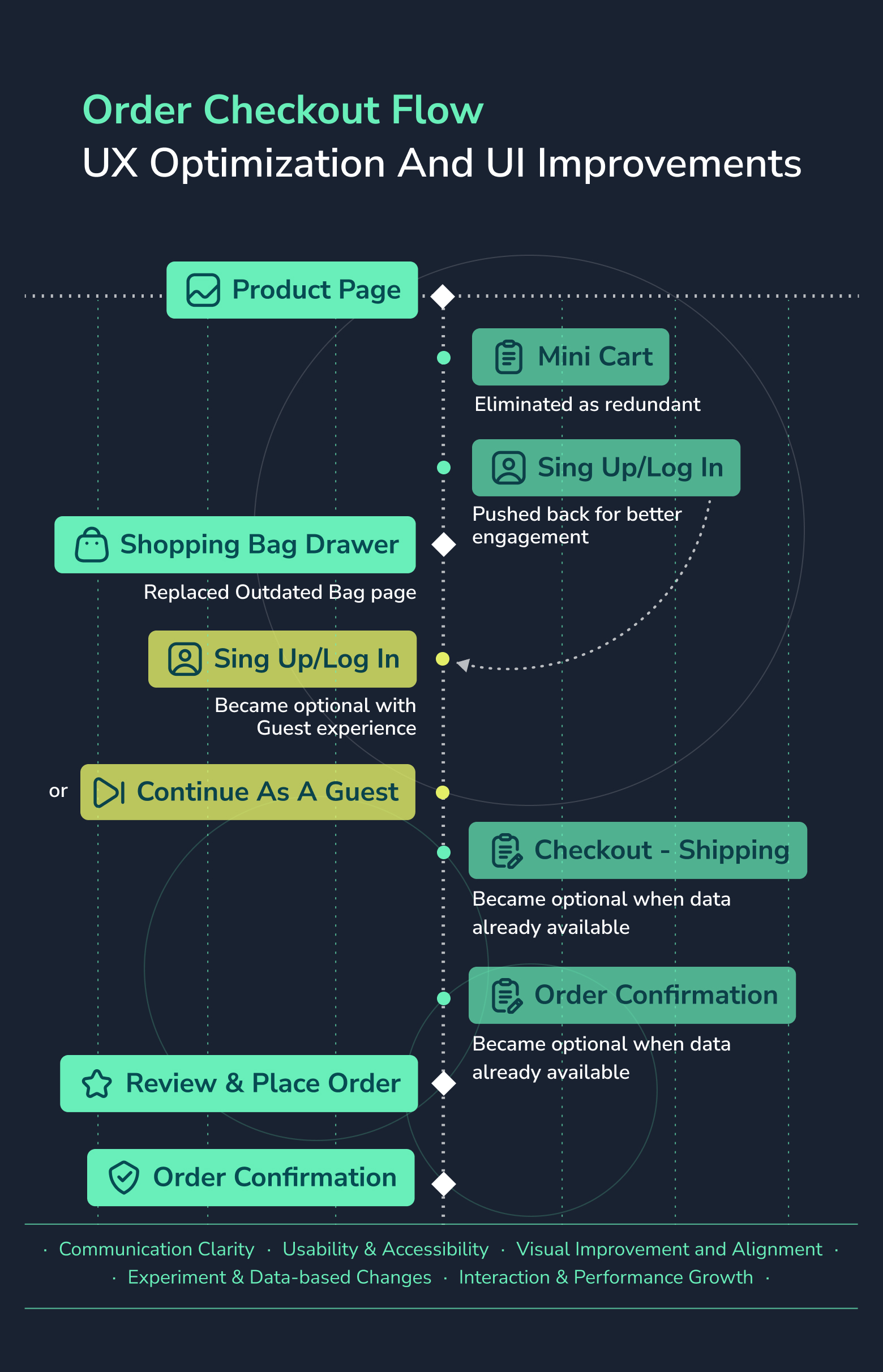
These refinements led to a 2.8% increase in checkout conversion and a 10% reduction in completion time, creating a faster, more intuitive purchasing experience.
Seamless Branding Refresh
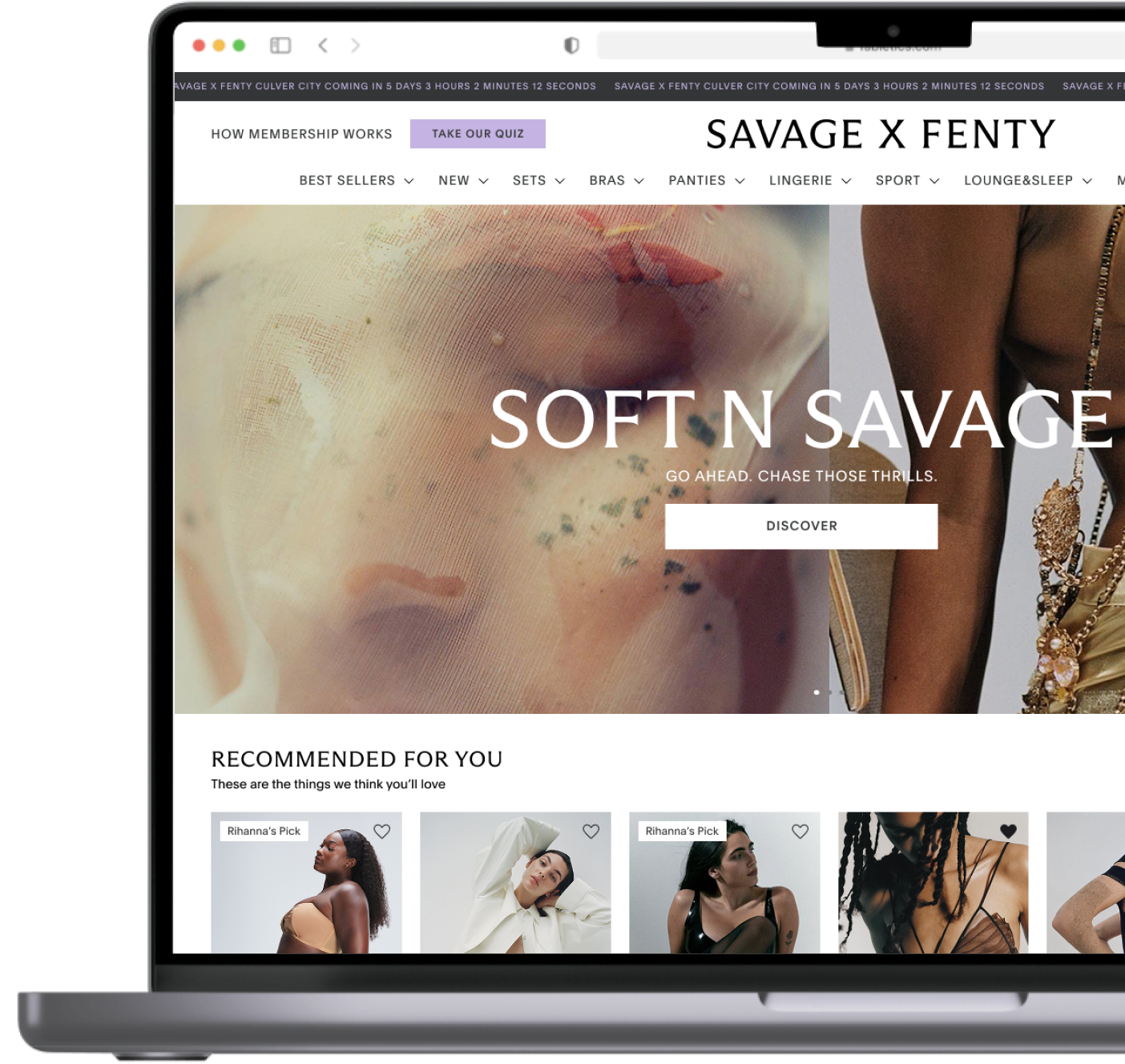
In a fast-paced three-sprint collaboration, I led the design team at Whitespectre in executing a comprehensive site-wide rebrand for Savage X Fenty, working closely with stakeholders and developers to ensure a seamless transition. This initiative showcased agility and efficiency in both design direction and implementation, balancing bold brand expression with usability and performance.
Elevating Brand Presence & User Perception
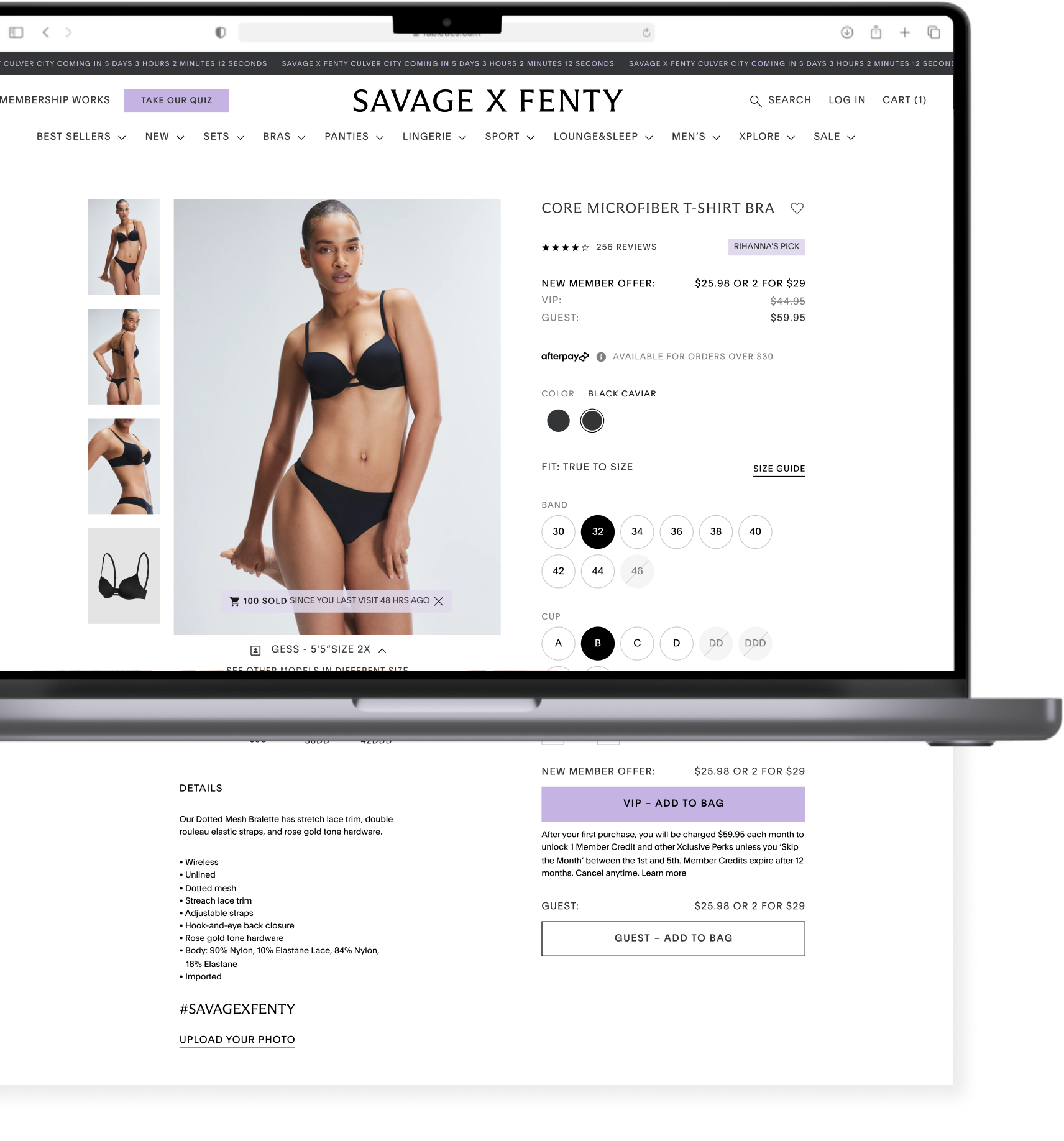
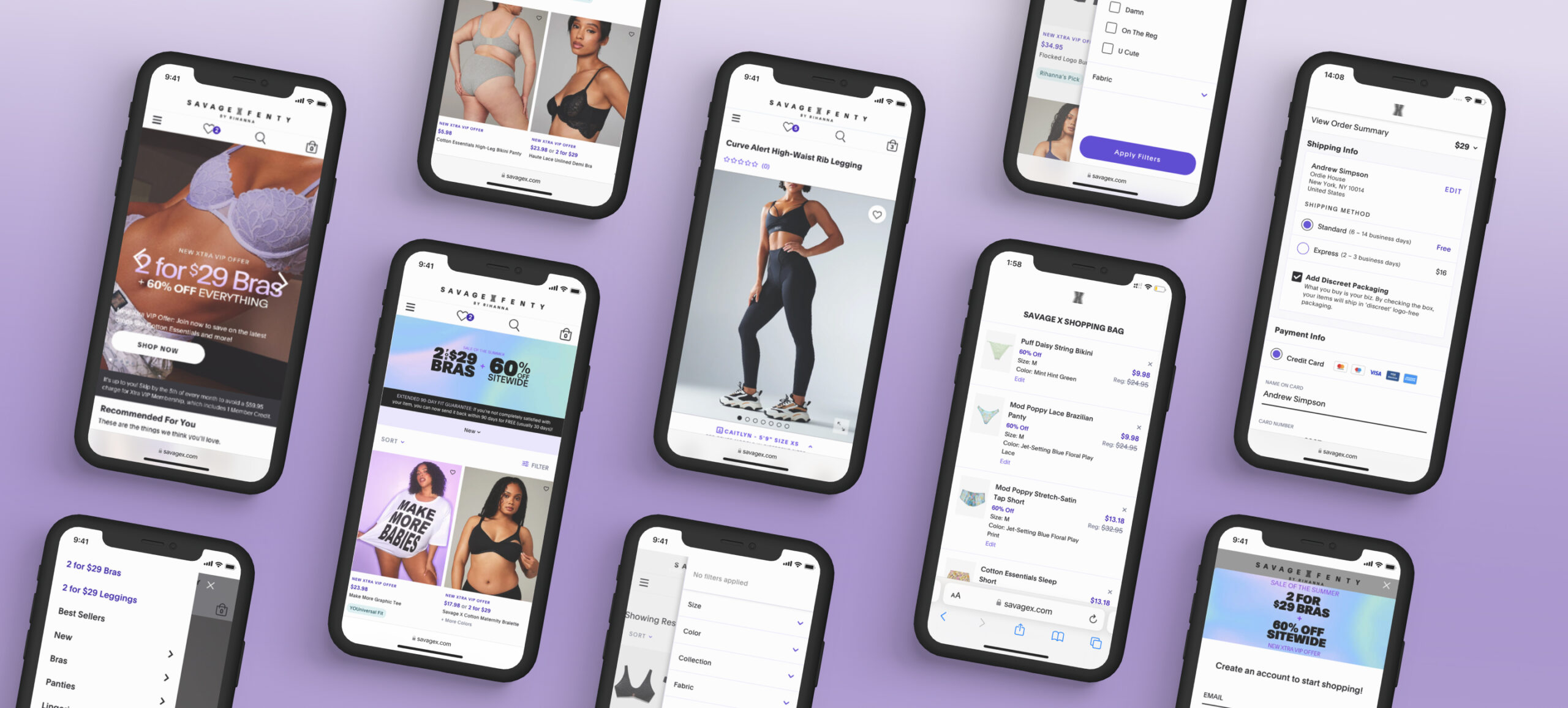
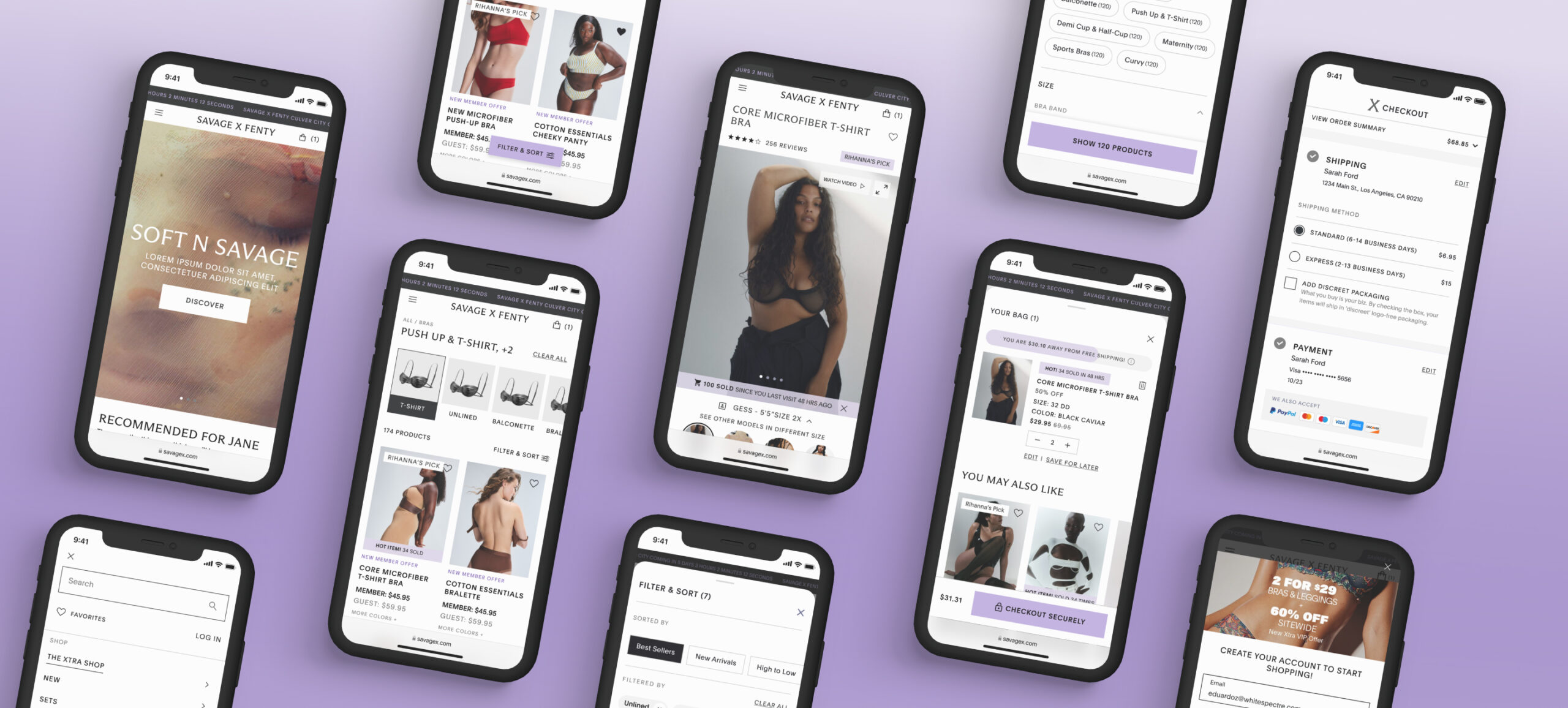
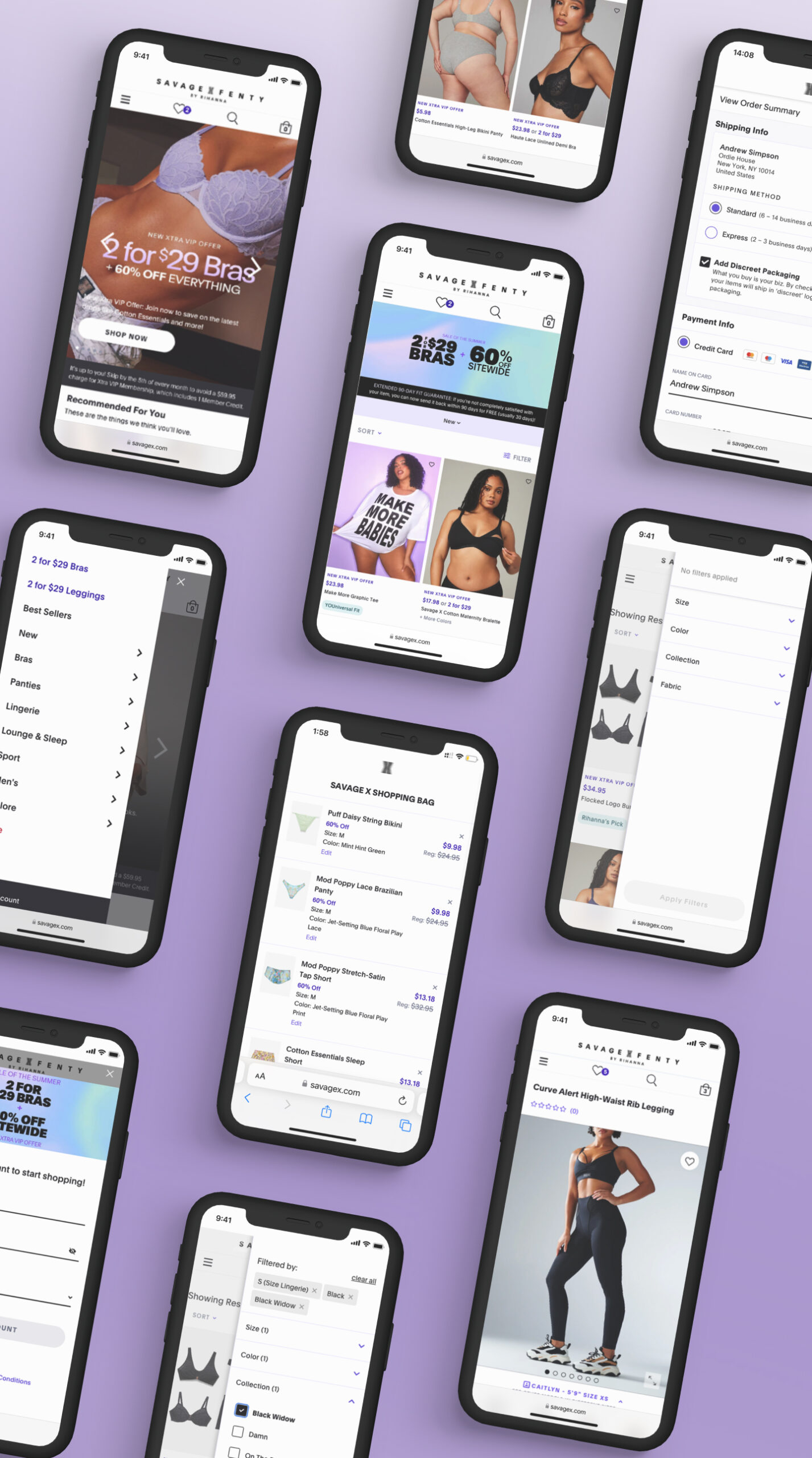
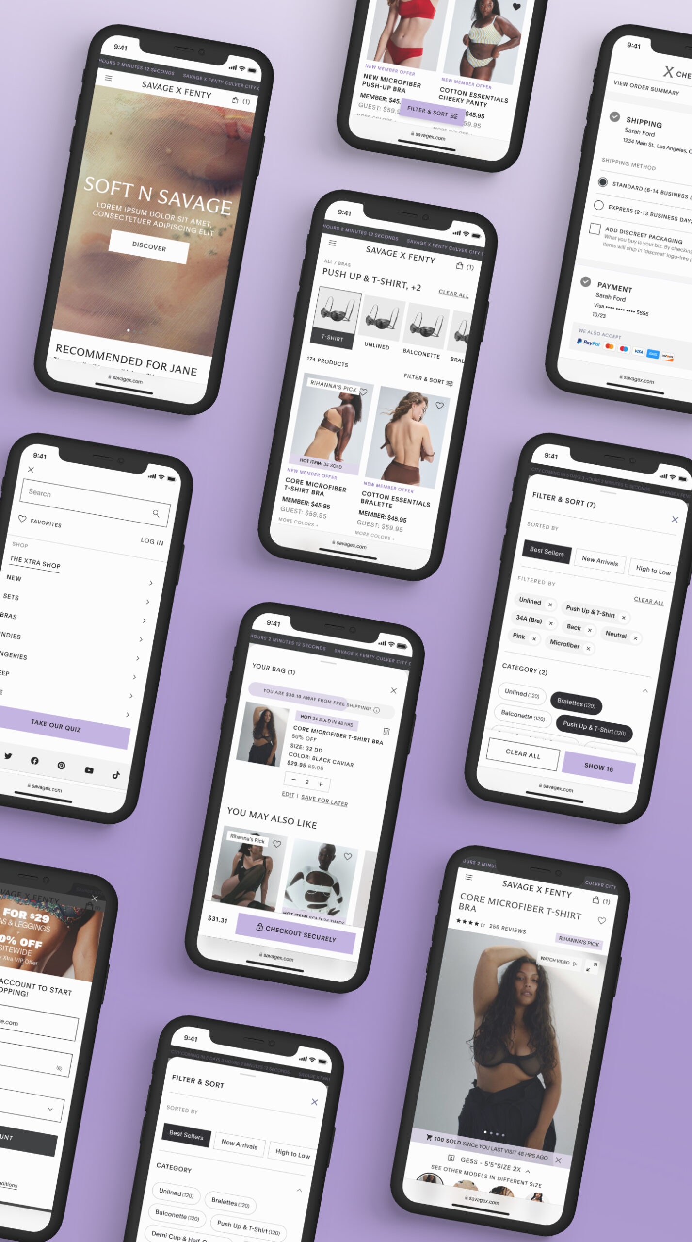
The rebrand aimed to create a more impactful and cohesive brand identity, strengthening the way users perceive and engage with the Savage X Fenty experience. We revamped the entire website’s visual style, ensuring it not only aligned with the brand’s bold, confident identity but also improved content clarity, contrast, accessibility, and overall communication.
Key updates included:
- Refined color and typography palettes to reinforce the brand’s bold, confident aesthetic.
- Sharper, more structured UI elements that enhanced visual hierarchy and usability.
- Mobile-optimized design refinements to ensure a sleek, clear, and high-performing experience across devices.
Scalable & Systematic Design Foundation
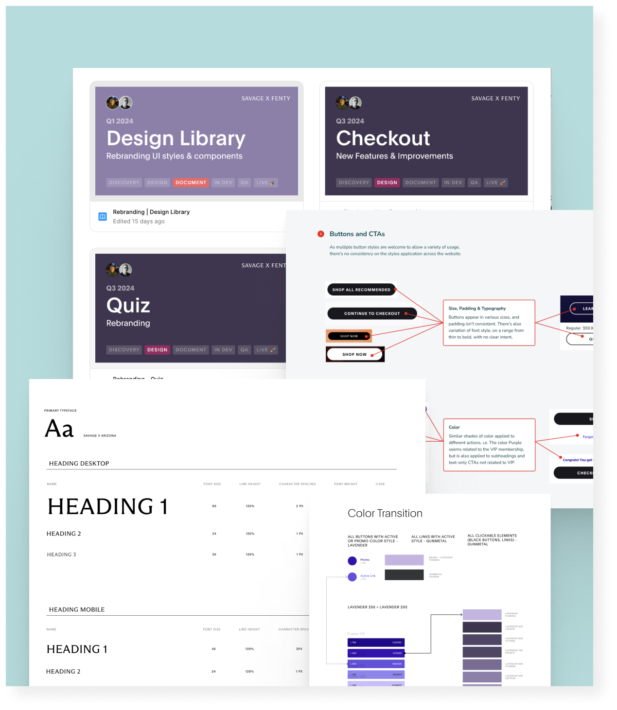
Beyond the UI refresh, we overhauled the Figma design environment, introducing a well-structured project file network and a comprehensive Design Library. This ensured:
- Faster access to the latest designs and improved team workflow efficiency.
- Seamless design-to-development handoff, reducing friction in implementation.
- A scalable design system ready to support future iterations and growth.
Completed under tight deadlines and in deep collaboration with stakeholders and developers, the rebrand was successfully launched with high-quality execution, zero major post-release issues, and an uplifted user experience that drove stronger engagement and performance.
Optimized Product Discovery & Navigation
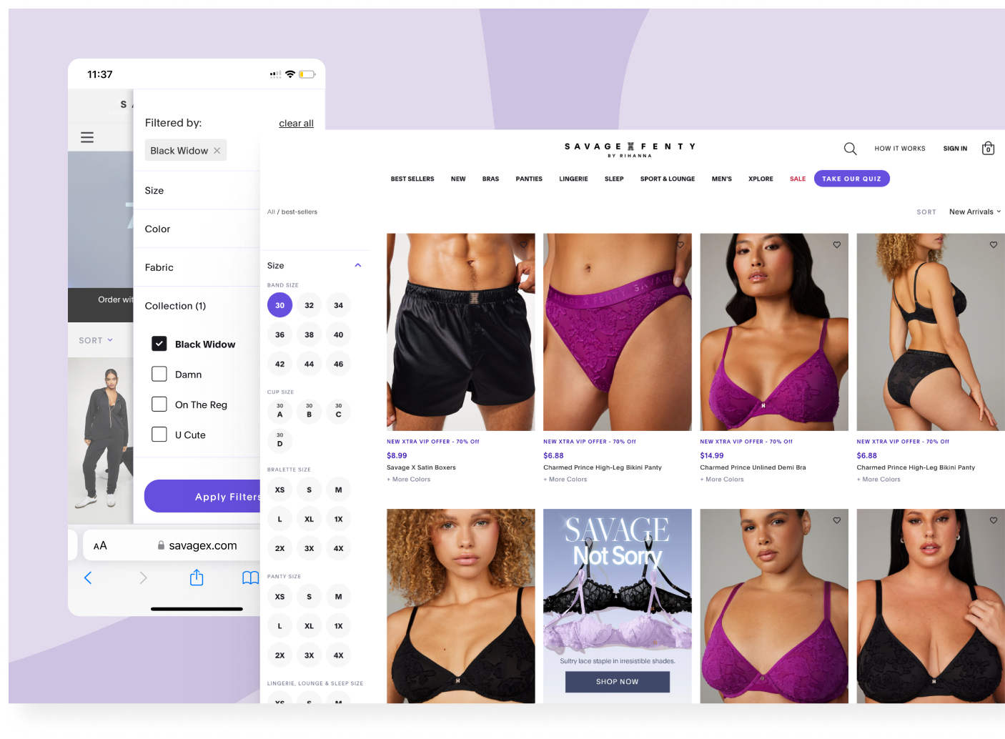
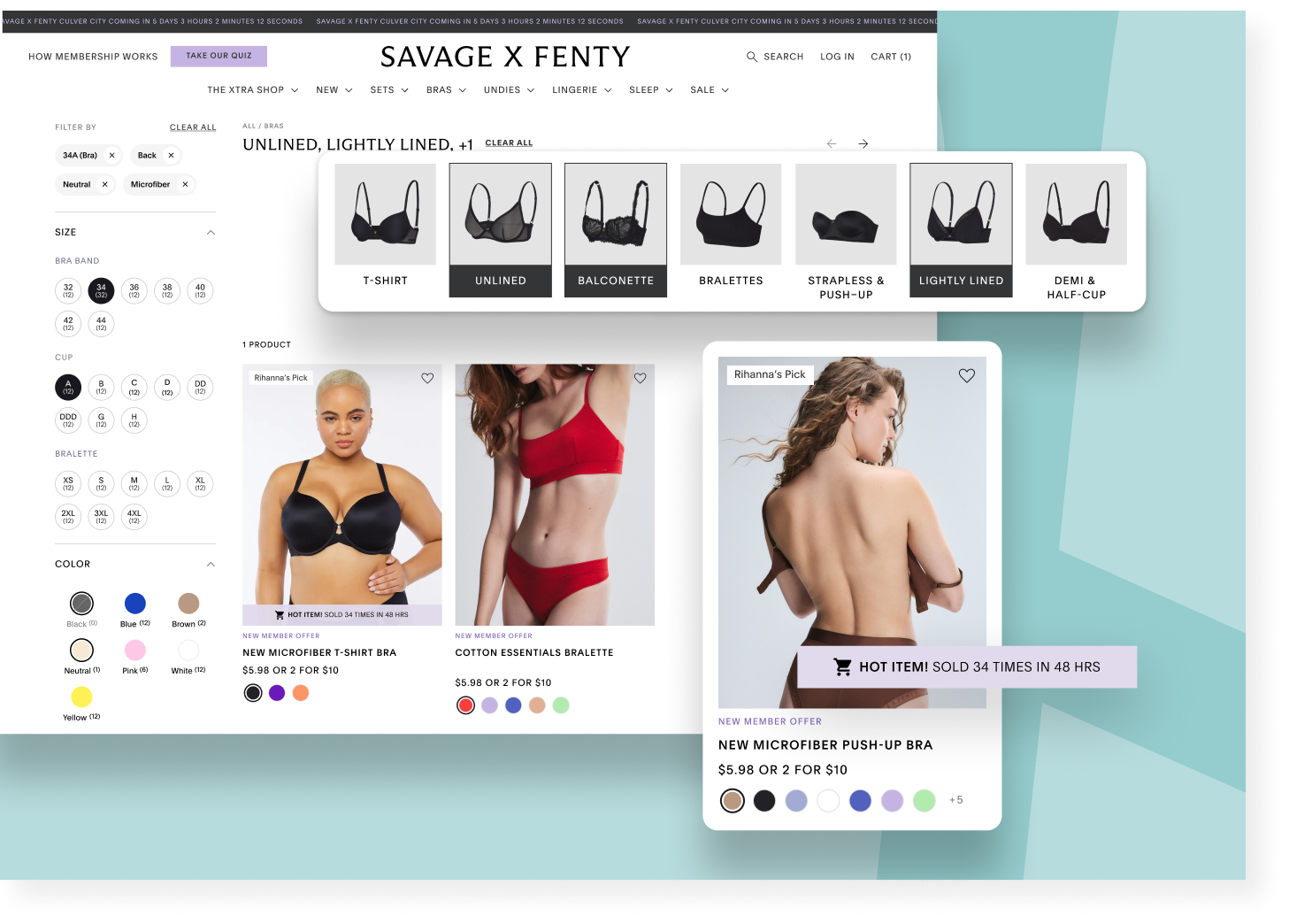
Another key area for improvement was the Product Listing Page (PLP), which lacked clear product context and intuitive navigation—especially on mobile, where over 80% of users browsed. Filtering options were outdated or ineffective, and infinite scrolling made it difficult for users to navigate back and forth efficiently.
By enhancing communication clarity, navigation structure, and user flow, we made product browsing more intuitive and seamlessly connected discovery with checkout. These improvements led to a 12.8% increase in product list views and a measurable lift in conversion rates.
To achieve this, we:
- Redesigned Grid page navigation for improved clarity and usability.
- Revamped filtering and sorting based on best practices and real user behavior.
- Introduced a visual category bar to enhance interaction and product awareness.
- Removed redundant filters, and applied progressive disclosure to complex filters, reducing cognitive load.
- Built a mobile-first filtering experience with a swipeable drawer and sticky progress indicators.
- Replaced infinite scroll with pagination for easier navigation across product listings.
- Plus other refinements to improve the overall experience.
Shopping Bag Revamp: Streamlining the Pre-Checkout Experience
As the second phase of checkout funnel improvements, we reimagined the Shopping Bag experience, addressing key usability issues that created unnecessary friction before checkout.
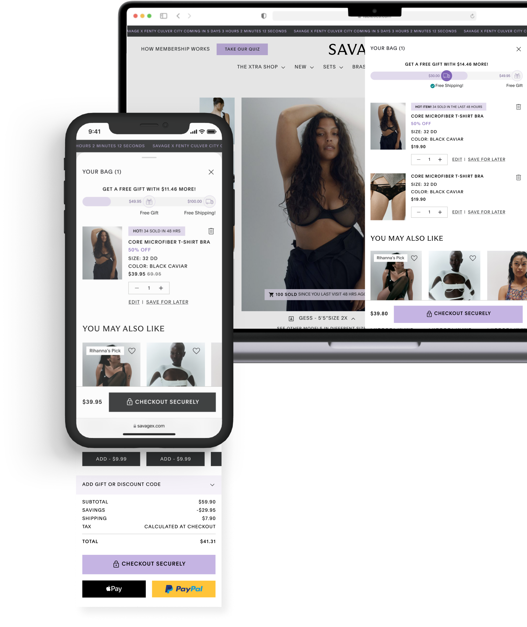
The previous version was outdated, with limited product information and poor management functionality. A mini-cart preview appeared upon adding an item, but it lacked essential details—such as quantity, color, and size—forcing users to open the full Shopping Bag page just to review their order. This extra step disrupted the shopping flow and negatively impacted conversion rates.
After user testing and data analysis, we introduced a unified side drawer that provided:
- Comprehensive product details, including size, color, and adjustable quantities—without needing to leave the page.
- A progressive order summary, displaying not just item prices but also shipping and tax costs upfront.
- Smart product grouping, consolidating identical items instead of listing them separately.
- A free shipping progress bar, helping users track how close they were to unlocking free shipping.
- A sticky summary bar with the total price and a prominent CTA, ensuring quick and easy checkout access.
- Enhanced display for sets and bundles, clarifying product structure, visually breaking down multi-item sets, and introducing progress indicators for incomplete bundle offers, encouraging users to complete their sets for savings.
By reducing friction and improving clarity, the new Shopping Bag experience streamlined the path to checkout, minimized user frustration, and drove higher conversion rates.
Results: Transforming the Savage X Fenty Digital Experience
Over the past few years, we redesigned and restructured Savage X Fenty’s digital platform, driving measurable improvements in conversion, engagement, and retention. By prioritizing a mobile-first approach, we streamlined key shopping experiences, refreshed the brand’s look and feel, and enhanced overall clarity and usability.
Key achievements include:
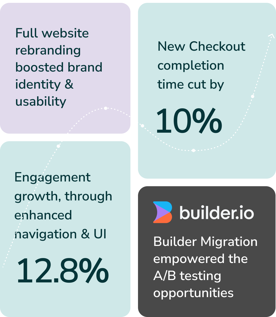
- Checkout flow optimization, leading to a 2.8% increase in conversion and a 10% reduction in completion time.
- PLP improvements, boosting product discovery and driving a 12.8% increase in product list views.
- Shopping Bag revamp, reducing friction and increasing seamless order completion.
- Seamless site-wide rebrand, reinforcing the brand’s identity while enhancing usability.
- Migration to Builder.io, empowering content teams with flexible A/B testing and independent content management.
Through strategic UX/UI enhancements and ongoing iteration, we helped elevate SXF’s digital presence, creating a more scalable, high-performing platform that continues to evolve with new innovations.
Other Projects

